Monday 14 February 2022

New Order - Movement


Info
Artist: New Order
Album: Movement
Year: 1981
Label: Factory
Design [Sleeve Design]: 
Peter Saville, Grafica Industria


The Inspiration

The album's cover was designed by Peter Saville and is based on a cover of the Futurismo journal of 1932 by the Italian Futurist Fortunato Depero.


"Movement happened in exactly the same way as Closer (Joy Division album). Rob (Rob Gretton, manager of Joy Division and New Order) brought them round and asked, "What are you into?" I said, Italian Futurism. I showed them a book, they put post-it notes in it and left. They'd marked a particular poster, so I said OK, something like this? Rob said, "No, not something like it. That." We don't have time to mess around. I was compromised with Movement, so I wanted to put: "Designed by Peter Saville, after Fortunato Depero". [Then] Rob said, "Those Futurists, they got mixed up with fascism, didn't they? We've had enough of that with Joy Division, take it off." But the whole point was that it is a Futurist poster. They called the record Movement and Futurism as an art form was focused around speed and movement. In the early 20th century, the world was speeding up and it was a conjoined art and political movement."

Peter Saville (graphic designer)


"One thing I like about him (Peter Saville) is that he is open to ideas but has a definite authority in what he believes to be good. Our covers, both for Joy Division and New Order, have come about in different ways: sometimes we’d take an image to Peter, other times we’d all sit down with him and look through books in the studio, or he’d bring something to show us. The Italian Futurist-style cover of Movement, for example, was entirely Peter’s creation."

Bernard Sumner (New Order, vocals)
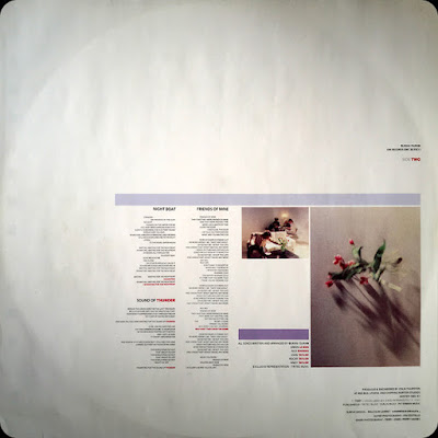

Design

The designers made subtle changes by substituting the text and reconfigurating graphic elements. The shape created by the top three lines is an 'F' (lying on its back), which refers to Factory Records/Factory Communications Limited.


The bottom two lines create an 'L' (lying on its front), the Roman numeral 50, the original catalogue was FACT 50. 


The blue colour of the lines was chosen by the band. The first copies in the US had the same design in brown on an ivory background. 


"In the days of vinyl, when people bought twelve-inch records, the artwork was very important because it represented the band and its taste. Also, we were of the opinion that if you bought a record with a great sleeve you were getting two pieces of art for the price of one: the music and the artwork. It was important to us, the sleeve. When we were kids buying records we thought the choice of cover for a record was really interesting. We’d wonder what it was saying, how it worked in conjunction with the music and what it said about the band. Today’s digital age has reduced the impact of a record sleeve, and I think that’s a great shame, but thanks to Peter we’ve had some fantastic ones. To begin with, I’d quite fancied doing the album covers myself. I used to become involved to a limited extent, because it was something I was really interested in, but as soon as Peter came along I knew we were in safe hands."

Bernard Sumner


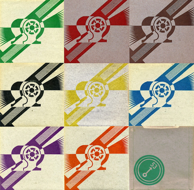
"Procession / Everything's Gone Green" Single


Similar to the album cover for Movement, the artwork is taken from a "Dinamo Futurista" (1927) magazine cover done by Fortunato Depero. 


Notably, the UK release's sleeve came in nine different colour versions, specified by different band members, their management and designers. The sleeve features no typographic information other than a catalogue number "53" on the reverse.


Depero Futurista


Known as the Bolted Book because of its signature binding using two industrial bolts, Depero Futurista was conceived as a showcase and “portable museum” for the work of Italian Futurist artist Fortunato Depero (1892–1960). Written and designed by Depero, it was published in 1927 and dubbed “a typographical racing car” by Futurism’s founder, F.T. Marinetti. Today it’s recognized as the first modern-day artist’s book.


Following the release of this book Depero moved on to New York, where he continued to paint, design for the theatre and work as a freelance advertising designer. He designed covers for magazines such as Vanity Fair, but the majority of his work was used to promote futurism as well as himself. In 1929, Depero wrote the outline for Il Futurismo e l’arte pubblicitaria (Futurism and the Art of Advertising), which spoke of the inevitable impact that advertising would make on art in the future.


Saturday 5 February 2022

Duran Duran - Duran Duran


Info
Artist: Duran Duran
Album: Duran Duran
Year: 1981
Label: EMI
Design [Sleeve Design]: Assorted Images, Malcolm Garret
Photography: Fin Costello

The Idea

“We asked Fin Costello, a photographer whose work we liked, to shoot the album cover. I wanted an old car in the picture, to give it a Gatsbyesque, neoclassical vibe. But I paid the price for the suggestion, getting stuck at the back, my eyes barely visible. I’m not crazy about the photo that was chosen for the cover of the album. None of us were, as there were many better pictures of the band taken that year, but the design that wraps around the image is superb.”

John Taylor (Duran Duran, bass guitar)


Design

“At Nick’s suggestion, EMI brought in Malcolm Garrett, who had designed all the Buzzcocks’ artwork. Malcolm created designs that were thoughtful and clean. His Duran cover is a classic. It could have been designed by the great minimalist architect John Pawson. The band logo—my favorite of all our logos—was expensive to produce, with silver foil strips added for emphasis.

It was classy.

It said, “We are the new breed.”

John Taylor


“I was a real fan of (Garrett’s) work; I just thought he was brilliant. And what with the title of the single being Planet Earth, and the whole sci-fi, futuristic connection of Duran Duran’s name coming from Barbarella, I reasoned, well, the connections were going to be made whether we liked it or not, so we might as well reflect that to a certain extent. Garrett just seemed the perfect choice.”

Rob Warr (EMI label manager)


“Beyond a general discussion with Rob Warr (EMI label manager) that this was a band that had a fresh vision, I was effectively given free rein initially. They were one of a few bands calling themselves ‘New Romantic’ in what was already a post-punk world. I can’t actually recall that there was a brief as such. Knowing my work with bands such as Buzzcocks and Magazine, he just left me to get on with it. 

The name had been taken from a character called Durand Durand in the futuristic science fiction film ‘Barbarella’ starring Jane Fonda. I was a fan of this film myself, and it naturally gave me a bit of further insight into what the band were about.” 

Malcolm Garret (graphic designer)


 “Their name and the title of the song, ‘Planet Earth’, suggested to me the kind of graphics that an airline identity might have in the 60s – a contemporary, almost space-age look. I was leaning towards clean modernism, far away from the punk DIY imagery that was already looking tired. I also had in mind that I could develop a graphic system that would give consistency to subsequent releases. This gave me a controlled graphic environment to work within, almost corporate in definition, but always luscious rather than conservative.

I’m not sure who chose the specific Fin Costello photo for the first album cover, but I ensured it followed the clean lines and modernist aesthetic that were maintained throughout the whole campaign surrounding the album. The chrome foil accenting the band logo and main images front and back emphasised a blend of glamour and futurism. 


The photos I used on the inner sleeve were taken from actual 16mm film frames from the promo shot by i-D Magazine’s Perry Haines and Terry Jones for the second single, ‘Careless Memories’. I was always concerned with ensuring the visual links between the printed graphics with the new medium of video.”

Malcolm Garrett


The photographer

Fin Costello, the photographer of the group picture on the original 1981 sleeve, remembers that the shoot took place in an antique car sales garage, the Paradise Garage in Fulham in April 1981.

“The idea was to associate the band’s style with the Art Deco period design by using the De La Hey car featured as a prop. There was a major storm that day and the garage had a power cut, so there was no lighting or heating. All in all the shoot was a bit of a failure, but it was enough for the designer to get a cover shot from it.”

Fin Costello


The car


The Delahaye 135 is a luxury car manufactured by French automaker Delahaye. Designed by engineer Jean François, it was produced from 1935 until 1954 in many different body styles.


Image


"Every three months we had to come up with a new look. And it wasn't just videos. There were album covers and picture discs and posters. We had to come up with a new identity, a new band persona, for every photo shoot. There were four years in particular, from "Planet Earth" to "A View To a Kill," where we had to completely reinvent the look of the band at least four times a year. And that's a lot of work. And sometimes you're not going to get it right. We didn't have stylists. We didn't have anyone shopping for us. We figured it out for ourselves, and I think we did a pretty good job."

John Taylor


"We always chose our own clothes and put things together ourselves. I remember the first time we encountered a stylist was the late 1980s. We hadn’t had a clue that people like this existed. [Before that] it was all very naive. We didn’t really have to think about it. We’d just go and find things that we liked and somehow we grew together. It’s like being in a gang, being in a band. Nothing was manufactured as many things are now. We got together from school . . . . It was definitely in our mandate [to find our own look], but we weren’t looking for something unnatural. We were actually just searching for things that we thought were cool and often we’d find women’s clothes, because actually men’s clothes weren’t particularly flamboyant at that time, so we’d literally go to small women’s boutiques and buy jackets off the shelf or a shirt that buttoned the wrong way for us, but it didn’t really matter. And you’d mix that up with leather trousers that you’d managed to find in Birmingham or from a biker shop or something, and then you’d find a shop like Kahn & Bell, which was a dream, because everything they made we wanted to wear."

Nick Rhodes

“Crossing over from the end of the 70s into the 80s, there wasn’t much money around. There was a lot of unemployment and young people thinking, Well if I can’t get a job I’m just going to do something myself. Quite often that’s what happens in times of recession: young people get really creative. It becomes about making your own clothes and your own way, being creative in your chosen field, simply because you couldn’t actually afford to buy it.”

Beverley Glick aka Betty Page (music journalist)


Singles

First three singles, "Planet Earth", "Careless Memories" and "Girls On Film", followed similar form as  the self-titled debut album.

"Planet Earth"


 7''


12''


"Careless Memories"


 7''

"Girls On Film"

 7''
 7'' back

 Night version


1983 reissue

In 1983 the album was reissued in the US to capitalize on the band’s success. The cover art was completely different, with an updated band picture, different colour scheme and new graphics.


“A friend of mine, she has a fairly comprehensive library of typography books, and I can remember this one particular book where I saw that double-D drawn like that. So I stole it (laughs). But the shapes, that was just me, my Modernist background coming through; that’s just my natural way of working. I always work with shapes and three-dimensions in a two-dimensional plane. So I start with something like the double-D, with the one slanted, and that suggests to me that I can then play with this idea of three-dimensionality. It’s about taking something which is flat—like the cover of a record sleeve—and introducing some kind of three-dimensionality into it.”

Malcolm Garrett