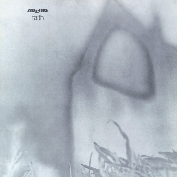
Info
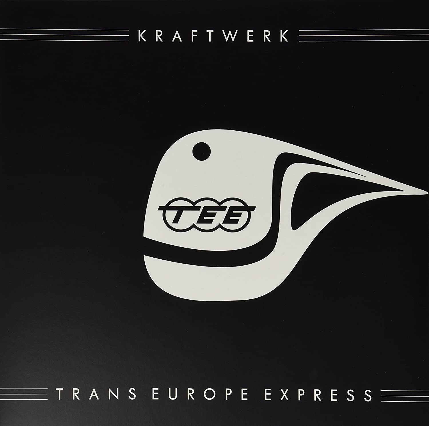
Artist: Kraftwerk
Album: Trans-Europe Express
Year: 1977
Label: Kling Klang
Cover (Inner sleeve, Poster): Emil Schult
Cover (Inner sleeve, Poster): Emil Schult
Photography By [Front Sleeve] – Maurice Seymour
Artwork
"We've worked with Emil Schult. He is a graduate in the Dusseldorf art Academy. We work together on the composition of lyrics, poetry, sound poetry and also visually. He does album covers and things we discuss together and work at together, but he's one who does this visual part actually".
Ralph Hutter (Kraftwerk, lead singer, electronic)
The artwork originally intended to be based around "The Hall of Mirrors" with the reflections of all four members in a series of mirrors. However, this may well have been dropped due to its similarity to Fripp and Eno's cover to their album "NoPussyfooting".

Eventually for German release a photo by New York-based celebrity photographer Maurice Seymour was selected. Cover photo is retouched version of an earlier photo, which was used for promotion purposes.

Non-retouched promo photo
This photo was taken during one of Kraftwerk's first visits to the USA and for the purpose of the cover has been processed to have more 1930's look.
Maurice Seymour
Brothers Maurice Zeldman (1900-1993) and Seymour Zeldman (1902-1995) were celebrity photographers who worked together and separately in the United States as "Maurice Seymour" from 1930's through 1960's.
The Brothers come to Chicago from Russia in 1920. After working for a few years for Bloom's Studios in the State-Lake Building ("Bloom was the Maurice Seymour of his day", says Maurice), they launched their own studio in 1929. "We were in business together and Maurice Seymour sounded better than Zeldman, so that's how we named the business."


The brothers worked together for the most part, photographing the ballet, musicians and entertainers, but they also worked individually some of the time. Their style of photography was pretty identical and you really can't tell one from the other. Maurice legally changed his last name to Seymour. His brother, Seymour, also changed his name to Maurice Seymour when he moved New York and established the company's New York City studio.

International release
For Some international releases another photo of the group was taken by a different photographer J. Stara in Paris.

"The cover was a gentle color reproduction of the four of us created from a skillful photocollage made by celebrated photographer J Stara during a complicated photo session. We had discovered the photographer's studio next to the Arc de Triomphe back in 1974, during an earlier concert in Le Bataclan, a bar wreathed in marijuana smoke on the Boulevard Voltaire.
He took group shots in a process he had developed himself, photographing each member individually in a separate corner of his studio in front of a black molleton cloth. If we'd all been photographed together we would have ended up looking at each other, which would have been a stupid group dynamic, and certainly wouldn't have been the strong projection of our personalities that can be seen on the album cover. Stara took shots from all perspectives, in both colour and black and white, later developing the best negatives and mounting them into a dynamic grouping, taking care that there was no one at the back who didn't have a smaller face than anyone at the front. Everyone had to have the same significance in the picture. If look closely at the picture, it looks like we're all a little distant from each other, as if we didn't know each other, and each of us has his own aura. After he had finished taking the photograph, he coloured it in with a special spotting technique that he had also developed, which he executed with a brush less than a millimeter thick."
Wolfgang Flür (Kraftwerk, percussion, keyboard)
There are two reversed versions of this picture. In fact the photo was firstly used on the back of the German version.


2009 edition cover
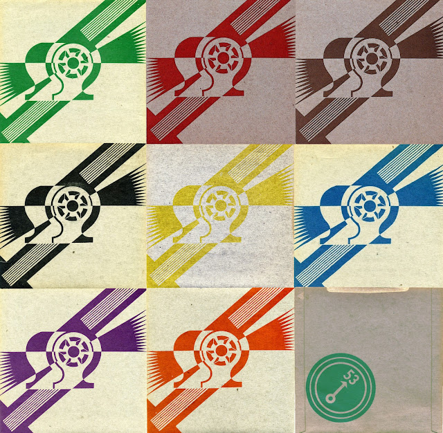
Inner sleeve

"This is a collage of a Maxfield Parrish painting, a photo and my artwork."
Emil Schult (artwork, graphic design)
The photo in question is an earlier portrait of Kraftwerk, first published as a promotional photo for the "Radio-Activity" album and on the German 7" single cover for "Radio-Aktivität" in 1976.

Maxfield Parrish was an American painter and illustrator active in the first half of the 20th century. He is known for his distinctive saturated hues and idealized neo-classical imagery. Parrish's works influence pop culture and specifically pop and rock music. A part of his painting "Daybreak" is used in the inner sleeve collage of "Trans-Europe Express" LP.
.jpg)
The same picture has been used by British band Dali's Car for cover art of their only album "The Waking Hour".

Album title
"The idea of the title had occurred to Ralf, Florian and the French journalist Paul Alessandrini as they were eating a meal in the restaurant Le Train Bleu at the Gare De Lyons in Paris. Because of its theme, and because of the illustration of us on the front cover and the poster insert, this album contributed significantly to our unique German image."
Wolfgang Flür
"We were trying to think of somewhere to have lunch. I suggested Le
Train Bleu (a restaurant on the first floor of the Gare de Lyon building in
Paris). It's at the station where trains leave for Lyons, Marseille, Italy,
Switzerland, the Middle East etc. I knew that Ralf and Florian liked these
kinds of restaurants a lot. There was Maxime, Ralf, Florian, my wife Marjorie,
and me. We spoke a lot, whilst watching the trains which you can see leaving
from the restaurant window. I remember saying to them, "With the kind of
music you do, which is kind of like an electronic blues, railway stations and
trains are very important in your universe, you should do a song about the
Trans Europe Express."
Paul Alessandrini (journalist)
"There
was all this thing; the trunk road/Nationale 7, the Nationale 1, the European
motorway, it was fantastic. I was rediscovering what I had found in Chuck Berry
with "Route 66" or in the "Fun Fun Fun" of The Beach Boys.
The idea was really that Kraftwerk was a train which crosses Europe, and people
get into the wagons as one goes along."
Maxime Schmitt (Capitol Records' label manager)
Trans-Europe Express

The Trans Europ Express, or Trans-Europe Express (TEE), was an international first-class railway service in western and central Europe that was founded in 1957 and ceased in 1995. At the height of its operations, in 1974, the TEE network comprised 45 trains, connecting 130 different cities, from Spain in the west to Austria in the east, and from Denmark to Southern Italy.

“By using the train motif we were following the path of someone like Pierre
Schaeffer who made the first piece of musique concréte by only using the sound
of trains.
We had much fun during this period. I particularly remember this train trip that Maxime Schmitt organized for us for the launching of Trans-Europe Express in France. The record company had hired a train with old fashioned carriages from the thirties to travel from Paris to Rheims. The album was played to the journalists during the journey. By the time we arrived in Rheims and had visited one of the famous Q Champagne cellars all the journalists were drunk."
Karl Bartos (Kraftwerk, percussion, synthesizer, vocals)

"The movement fascinates us, instead of a static or motionless
situation. All the dynamism of industrial life, of modern life. We really speak
about our experiences, of life as it appears to us. Even the artistic world
does not exist outside of daily life, it is not another planet, it is here on
the Earth o that things are happening."
Ralf Hutter